I’m not a huge fan of baking. Two years later and my husband still gives me guff for registering for a rolling pin and never using it. But I have my reasons. Confuse a teaspoon of this with a tablespoon of that and poof! Your could-have-been-delicious Thanksgiving pumpkin pie turns into yucky pumpkin-flavored water soup. Give me a box of pre-made cookie dough that requires only three ingredients (as long as one of those is water) any day. So, after grocery shopping today, I’m “baking” some cookies.
And as they probably overcook in typical apartment-oven fashion, a topic for a blog post popped into my head: simple and easy. And, I have been doing a lot of website research lately. High-speed blend these things together and tada, a blog post on simple and easy homepages is born. Get ready to chow down on some delicious homepage design advice.
Here are my three key ingredients to a great website homepage design. They may sound simple at first, but they each take a lot of trial and error to get just right.
1. Straightforward Content
I can’t even count how many times I have landed on a website only to have no idea what the company does. If I can’t answer the question in 5 seconds or less, I’ll leave. I don’t care if you have the top Google result. Make it clear what product you make, what service you offer, and/or who your audience is right from the start; and I can’t stress enough the importance of putting this vital information above the fold. I know snazzy design is “in” but your visitors will abandon your site if design trumps all, especially clear intention.
2. Simple Navigation
People are kinda lazy. They want information quick and fast; so don’t make your visitors go on an endless treasure hunt for the information they need. A top-level navigation with three or four items that click through to subpages with more information (or drop downs with a few more options) is ideal. These items are often “features,” “products,” etc. Don’t make it too complex and always keep in mind how your navigation will translate to mobile devices. A good practice is to go through all the top subpages you think people will be looking for and ask, “does it intuitively fit under this navigation item or that one?” If it doesn’t, reorganize. If you can’t find it, a prospective customer certainly can’t and won’t spend too much time looking. Same goes for the footer. Keep it simple and useful, and not an exact copy of your navigation. I’ll dedicate a post to the footer sometime in the near future.
3. Visual appeal
Striking a fine balance between ingredients is key to any successful recipe. Because I learn best by example, here are a few websites who have either almost mastered the homepage recipe by mixing great design with great content, or whose designs have fallen flat. Design isn’t everything, but it’s extremely important.
The search I chose tonight is “music streaming websites,” since the only thing keeping me awake right now is JT serenading me with “I can’t wait ’til I get you on the floor, good-looking. Going hot, so hot, just like an oven.” Are my cookies done yet?

Pros: The logo is front and center, the login area is easy to find, and the CTA to download Spotify is really clear (and in multiple locations). The design is visually appealing and not a hot mess, and you know that the site is a music streaming service within the first few seconds of reading. Also, being a music service, it’s not text heavy. You don’t need a lot of words to say what you do.
Cons: It’s a site designed using Parallax, which means a lot of scrolling. The language selector is hidden at the bottom for those non-native English speakers (no bueno). The special offers are at the very bottom of the page (and if I’m a a poor college student, I’d want to know there is a discount!). Also, the first picture I see is a butt in a bikini. Be careful not to offend your audience. Be thoughtful in your design.
Grade: A-

Pros: The logo is obvious and the top navigation has the items I’d need to register, log in or get help.
Cons: Everything else. It’s a simple homepage, no bells and whistles. But there is almost no design, and it doesn’t scream “music site” by the visuals. The footer takes up ⅓ of the page. On my computer, I can keep scrolling for awhile but there is nothing down there. I’m focusing on the homepage, but I can’t mention Pandora without mentioning the horrible ad placement on the interior pages. Once you create a station you see ads, ads, ads unless you pay. Blech. Pandora is a very recognizable name, but don’t assume everyone knows who you are.
Grade: B
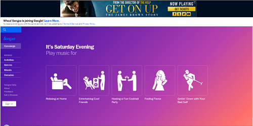
AHHH! This is the third result in my Google search, and I’ve honestly never heard of it. It’s not all bad, but it’s pretty damn close. The ad at the top makes me want to hit the back button instantly. I’ll give it a shot though and keep reading. The header is totally clear, so there’s that. I also like the use of icons, but they are kind of meaningless because without reading the text, which is tiny even on my abnormally large laptop screen, it’s not intuitive what they mean. And the colors, MY GOD THE COLORS. It’s like bubblegum ice cream threw up all over a Geocities page. I need to get out of here.
Grade: C-

This site looks pretty amateur. The orange CTA is nice and obvious and the search is dominant, but the background image is distracting, and the advertisement for the live performances is repetitive. I went back and gave it a second chance and the homepage did change.
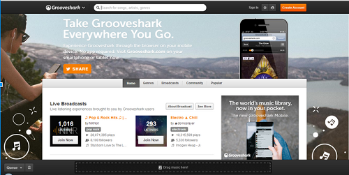
A little better. I know it’s mobile music by the first chunk of header copy. Still not in love with the full background image though, and it loads a bit slow. Overall, I think it’s just too busy. I checked it a third time and again got a completely different homepage. The experience is really inconsistent.
Grade: C

I was going to stop there because I’m pretty antsy to get in my PJs with my cookies and some 2% and watch some bad TV, but I saw Beats next on the list and thought, one more, why not. Can’t skip da Beats.
First off, I don’t think there’s nearly enough white space, do you?
The headline is clear and big, the CTA for a free trial is front and center, and the site controls have the must-haves, but the menu is hidden on the left and looks like a mobile menu, so that’s weird (and I know it’s not their demographic, but it’s not as intuitive for the older generation). There are at least 25 iPhones and tablet images on this homepage. Just kidding, there’s only … OMG there actually are 25! Mom, am I Rain Man?
The footer is nicely organized and the social icons are easy to find. I think the homepage is unnecessarily long, but as long as the important stuff is accessible from the top, the intention isn’t that I’d scroll all the way down every time once I paid for the product. So, they know what they’re doing. They are Apple, after all. Similar to Spotify, it uses the scrolling horizontal format, which translates well to mobile design. But this works best for more visual, less text-heavy websites.
Grade: A for Apple.
I hope with the three ingredients and some examples, you can start on the right path to a homepage redesign.
What are some of your favorite homepage designs? Tell me in the comments!
This post was paired with, you guess it! Gather round you friends of mine… It’s cookie time!
